
Miyya Cody
Resume
About Me
Overview
Problem
Solution
The goal was to redesign the entire flow to improve B2B purchase interactions—focusing on making it faster to complete orders, easier to assign devices to lines, and more tailored to businesses buying in bulk or managing multiple lines.
6 month completion
Lead UX Designer (me) • DevOps (6) • Business Analysts (2) • Marketing (3) • Junior Product Designer (2)
Heuristic Eval • Info Architecture • Figma Prototypes • UserTesting
6 month completion
Lead UX Designer (me) • DevOps (6) • Business Analysts (2) • Marketing (3) • Junior Product Designer (2)
Heuristic Eval • Info Architecture • Figma Prototypes • UserTesting
6 month completion
Lead UX Designer (me)
DevOps (6)
Business Analysts (2)
Marketing (3)
Junior Product Designer (2)
Heuristic Eval
Info Architecture
Figma Prototypes
UserTesting
When I started the B2B Cart Redesign project, one of the most urgent challenges was reorganizing not only the interface, but creating a system for how other designers might be able to streamline their design process for max proficiency.
When I started the B2B Cart Redesign project, one of the most urgent challenges was reorganizing not only the interface, but creating a system for how other designers might be able to streamline their design process for max proficiency.
The existing flow was fragmented, lacked transparency, and created friction in the checkout process. Not only did this affect sales efficiency, but it also placed additional strain on account managers who had to walk customers through tasks that should have been self-service.
Since I was the design lead on this project, it was my duty to create a more usable interface and design system that better spoke to the business customers and improved our overall workflow.
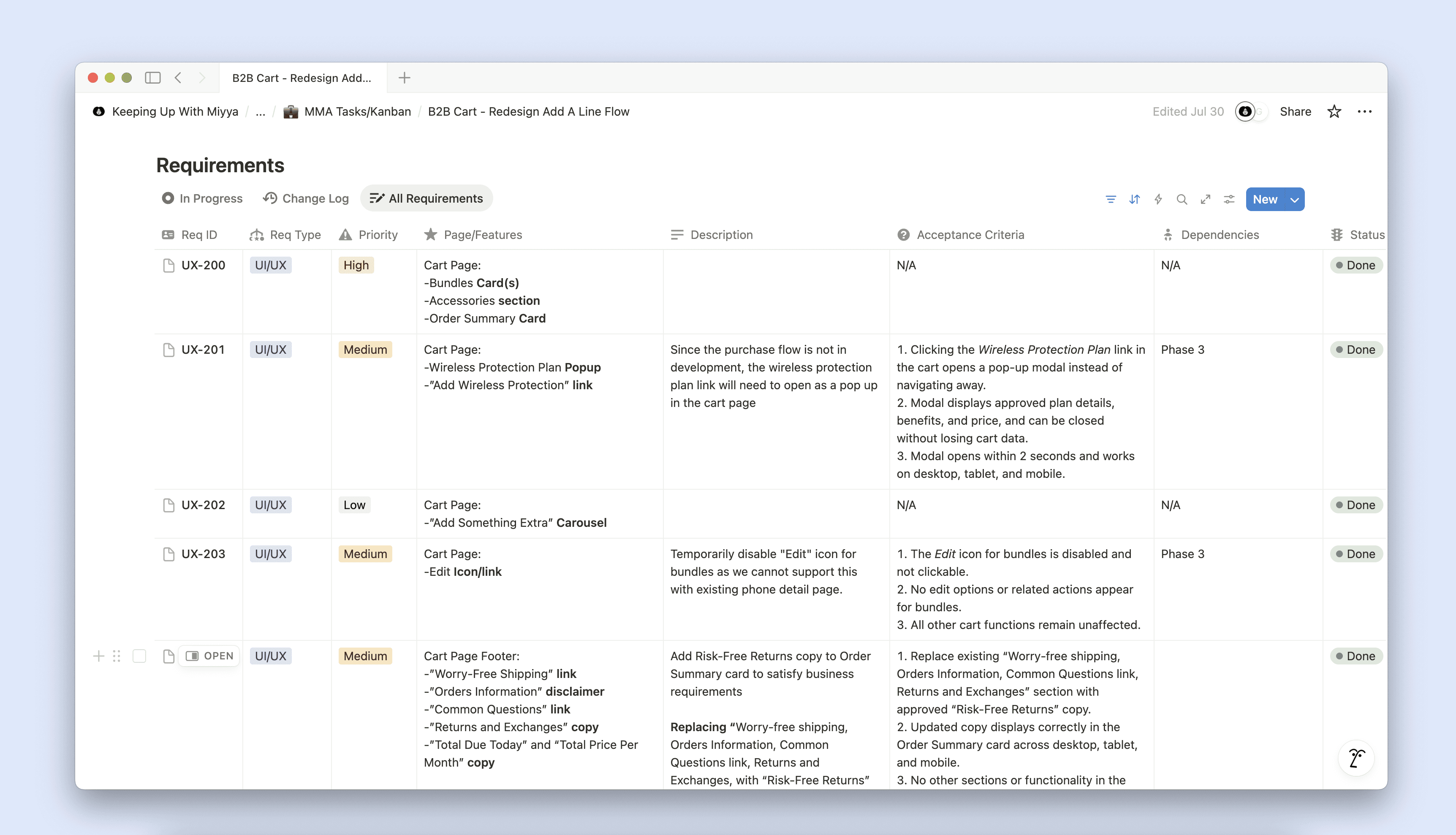
From the outset, I established a research-led strategy. I partnered with our product manager and engineering team to conduct heuristic evaluations, review analytics on GlassBox, and map the existing purchase journey. These activities highlighted three critical issues:
Customers could not easily track order progress.
The cart lacked error prevention and validation.
The overall design did not support onboarding for new users unfamiliar with the platform.
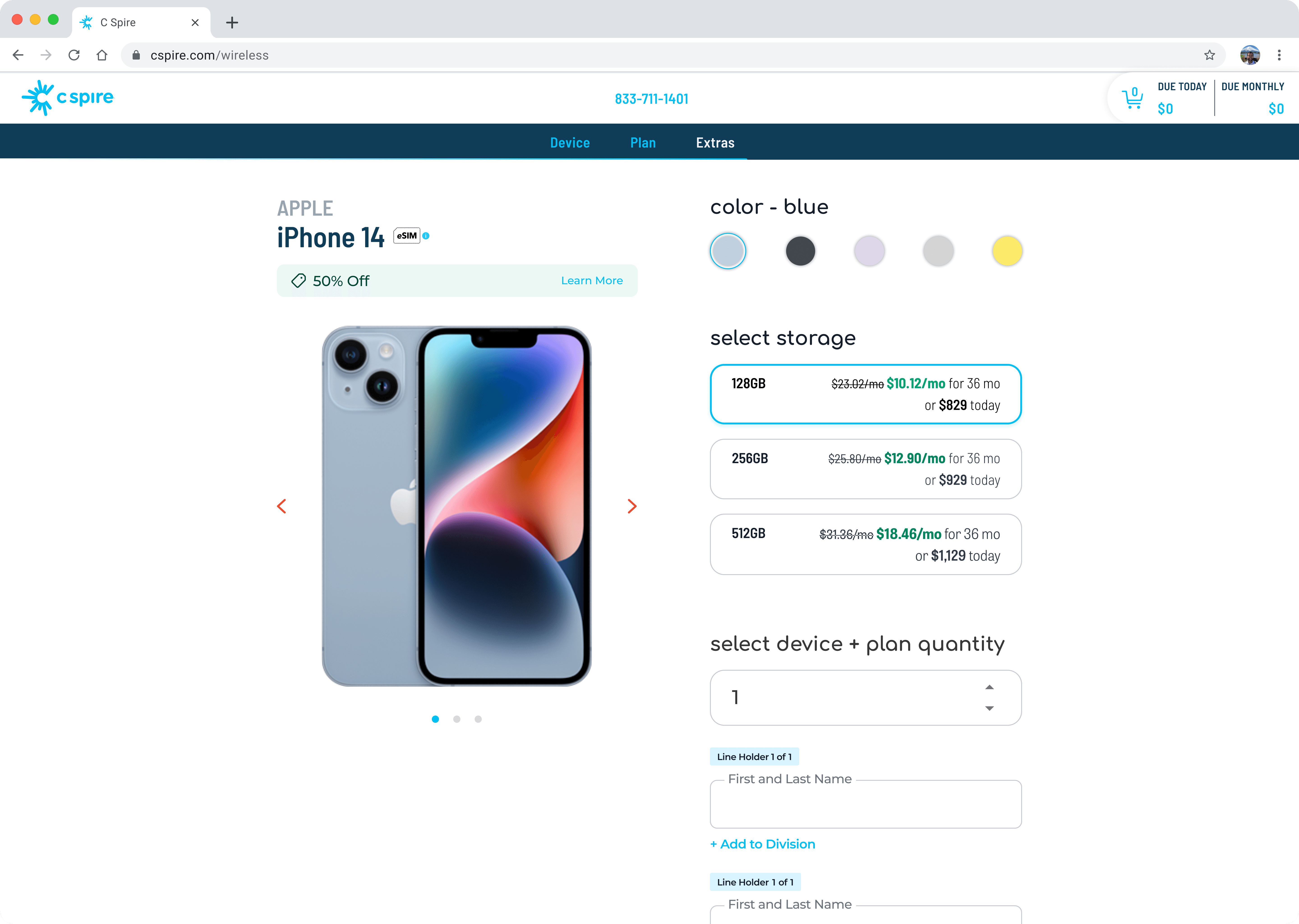
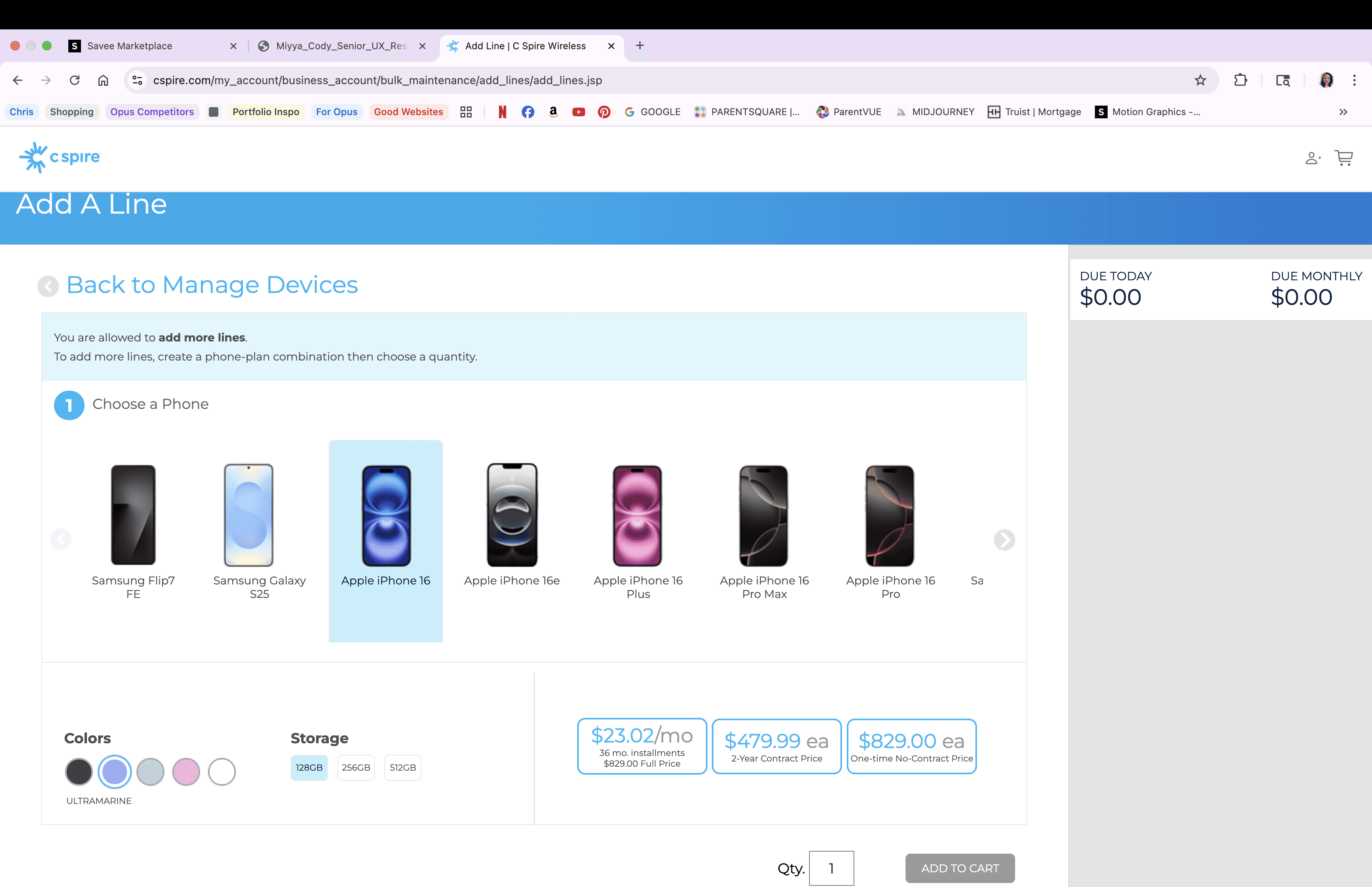
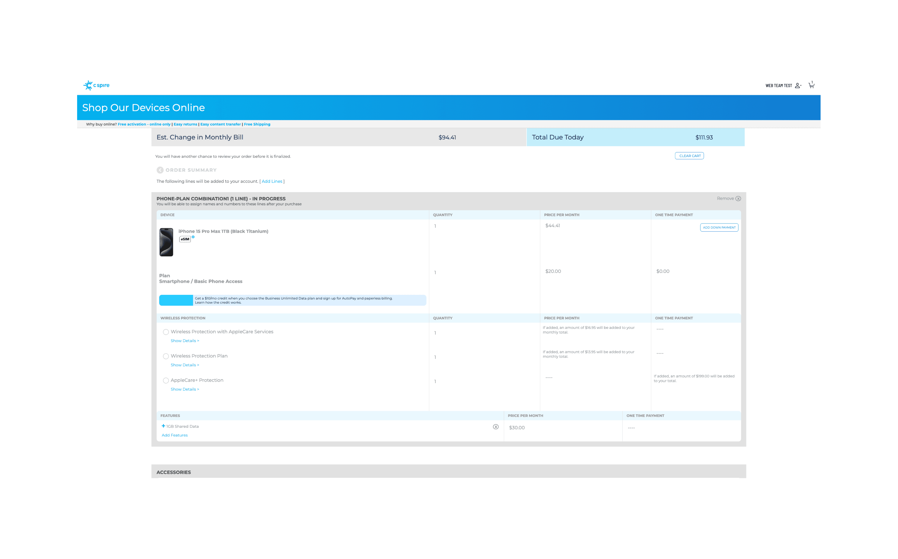
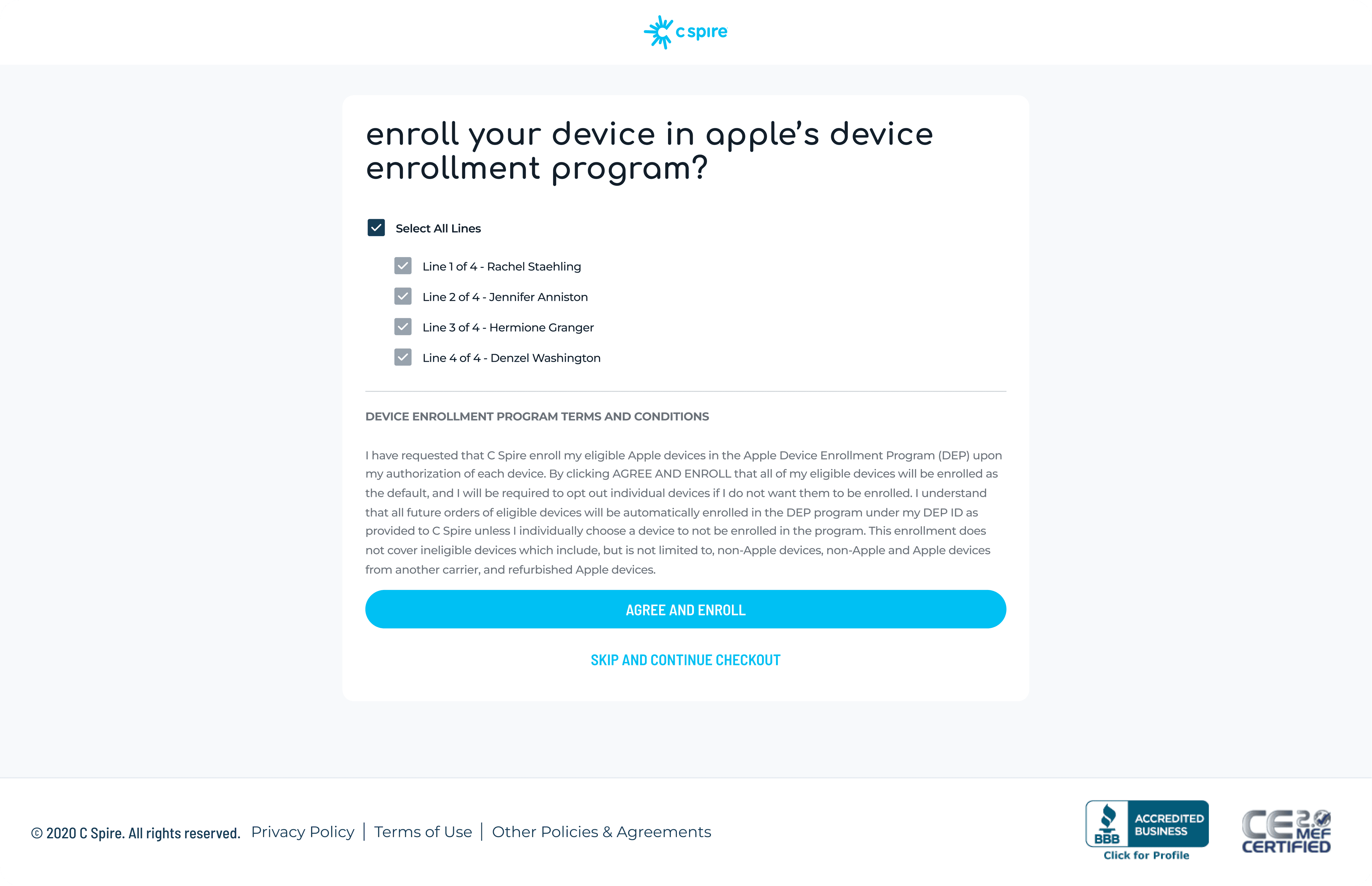
As you can see, the previous UX/UI flow is overly dense, lacks hierarchy, ignores B2B scale needs, and fails to provide a clean guided flow. It feels like a consumer cart force-fit into enterprise ordering, which frustrates users and increases error rates.
From the outset, I established a research-led strategy. I partnered with our product manager and engineering team to conduct heuristic evaluations, review analytics on GlassBox, and map the existing purchase journey. These activities highlighted three critical issues:
Customers could not easily track order progress.
The cart lacked error prevention and validation.
The overall design did not support onboarding for new users unfamiliar with the platform.
As you can see, the previous UX/UI flow is overly dense, lacks hierarchy, ignores B2B scale needs, and fails to provide a clean guided flow. It feels like a consumer cart force-fit into enterprise ordering, which frustrates users and increases error rates.
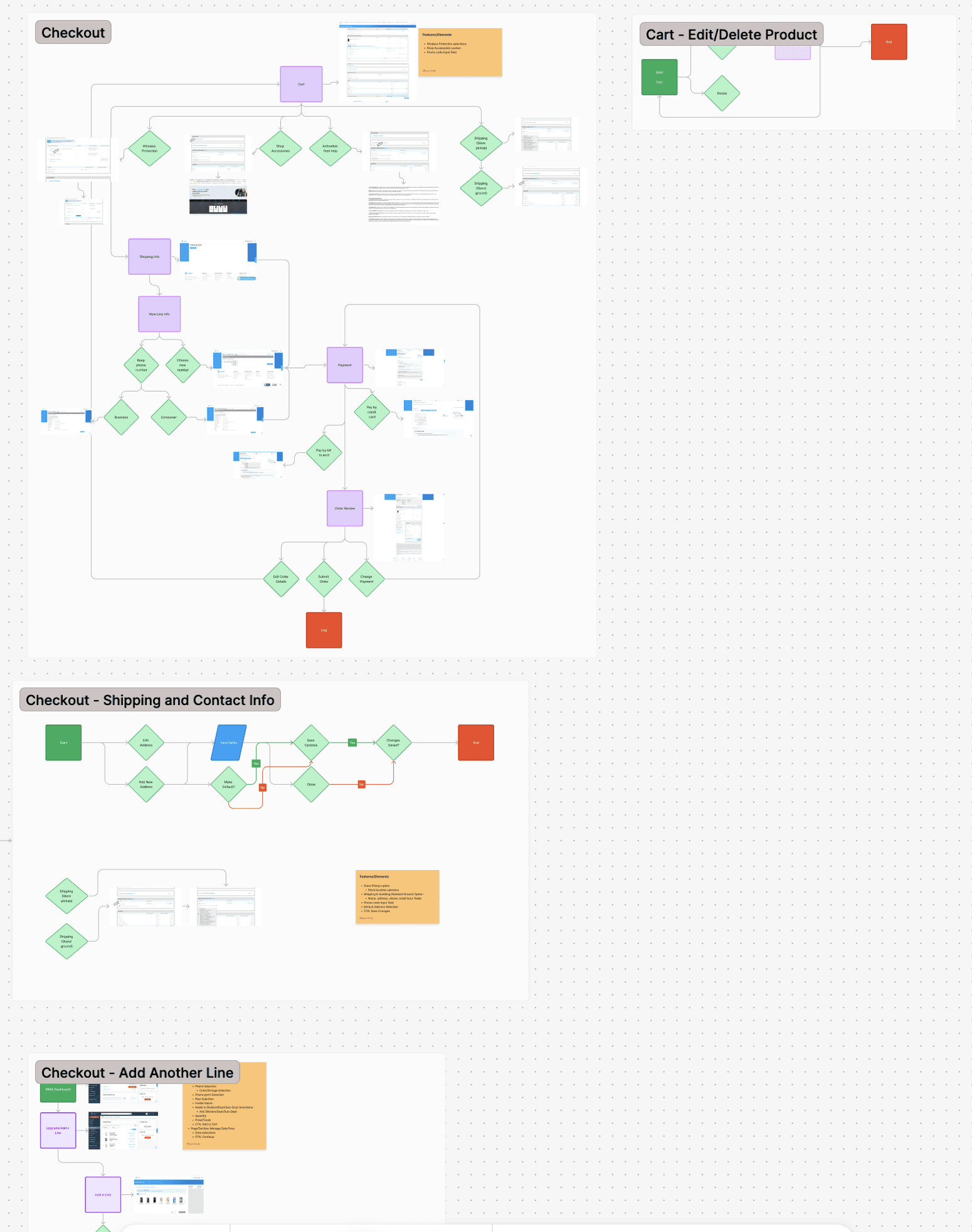
To address these challenges, I created a three-phase UX roadmap.
To address these challenges, I created a three-phase UX roadmap.
To address these challenges, I created a three-phase UX roadmap.
Phase one prioritized immediate usability fixes and accessibility compliance, including clearer error states, improved form validation, and standardized components aligned to WCAG 2.1 AA standards.
Phase two focused on embedding learning enablement into the cart experience, such as contextual tooltips, guided steps for new users, and inline explanations of technical terms.
Phase three outlined a long-term vision for AI-driven recommendations that would suggest add-ons or complementary services, helping customers make informed purchasing decisions while driving business growth.
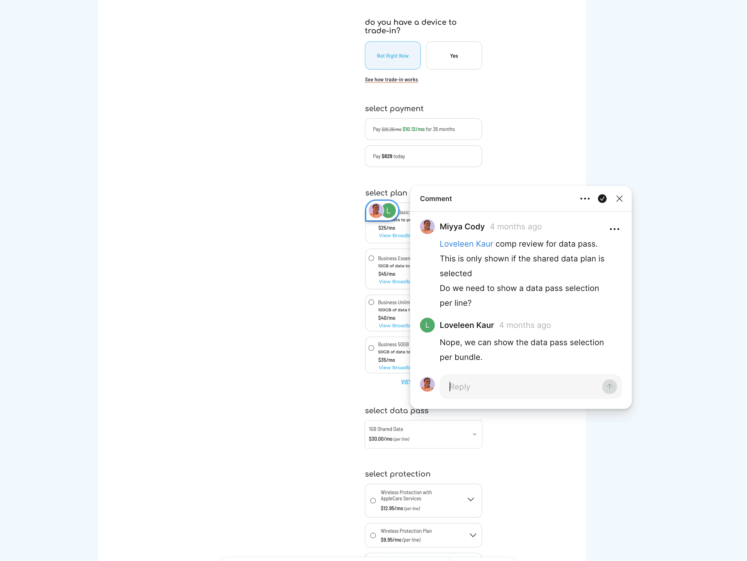
Leadership was a key part of my role on this project.
Leadership was a key part of my role on this project.
I mentored two junior designers, guiding them in usability testing, prototyping, and presenting findings to stakeholders.
Together, we developed and maintained a Figma component library that ensured design consistency across checkout flows, reduced design-to-development friction, and improved collaboration with engineering.
I also facilitated weekly design critiques to build confidence and elevate the team’s design quality.
The final design transformed the B2B cart into a clear, intuitive, and supportive purchase experience.
The final design transformed the B2B cart into a clear, intuitive, and supportive purchase experience.
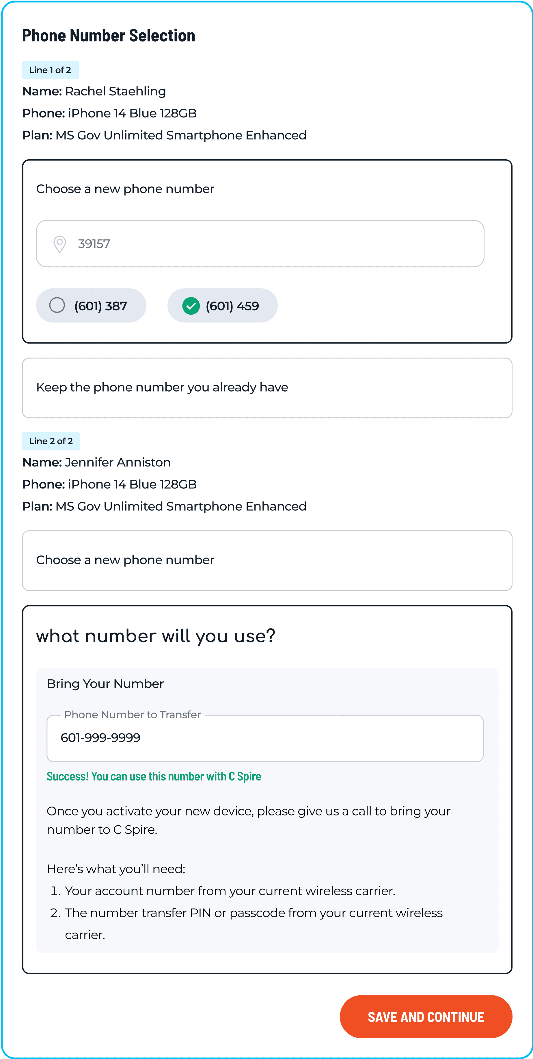
Customers were able to see progress at each step, validate information before submission, and access contextual help without leaving the workflow. Accessibility improvements ensured that all users, including those relying on assistive technologies, could complete purchases with confidence. The embedded learning elements reduced reliance on account managers by giving customers the tools to guide themselves through the process.
Customers were able to see progress at each step, validate information before submission, and access contextual help without leaving the workflow. Accessibility improvements ensured that all users, including those relying on assistive technologies, could complete purchases with confidence. The embedded learning elements reduced reliance on account managers by giving customers the tools to guide themselves through the process.
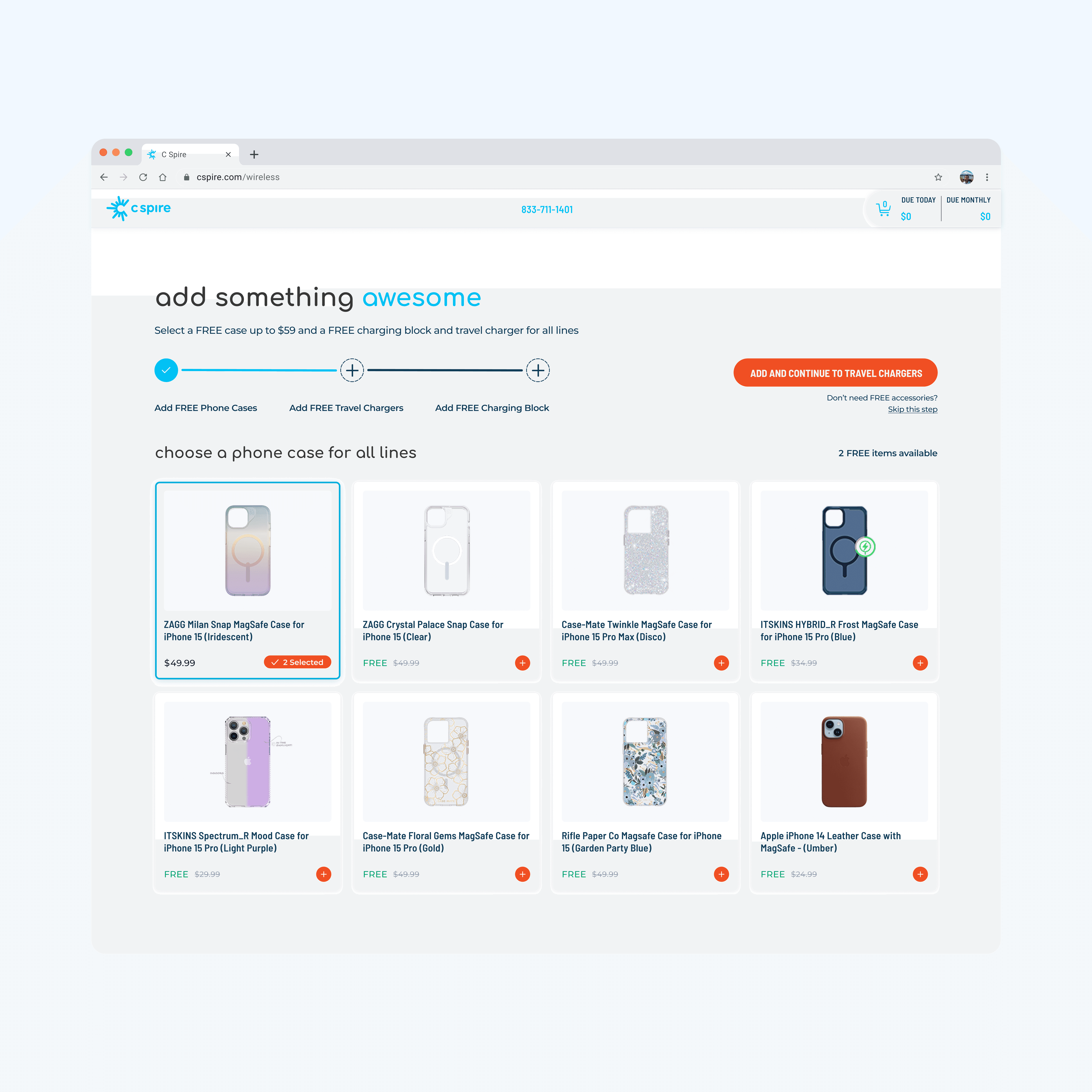
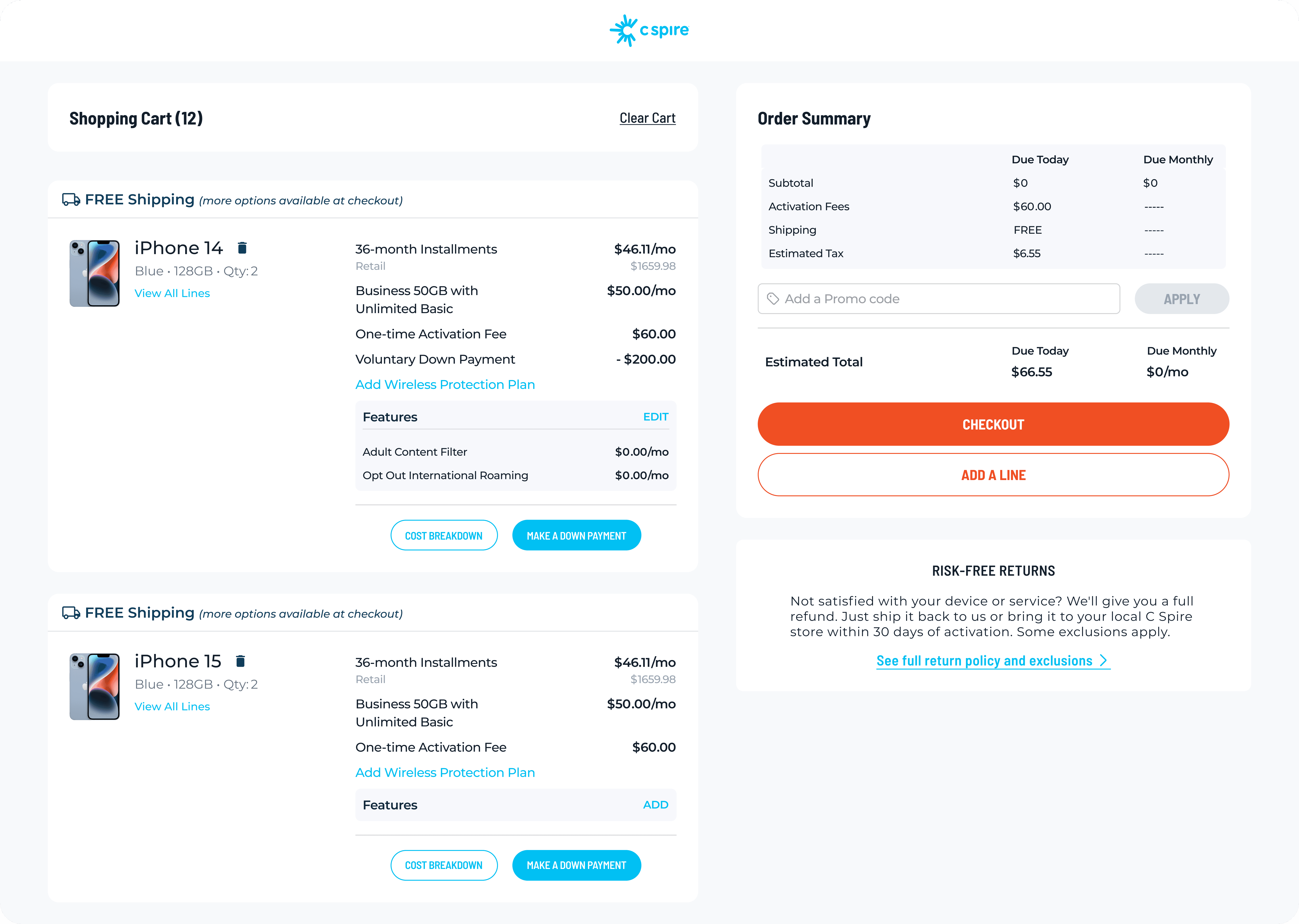
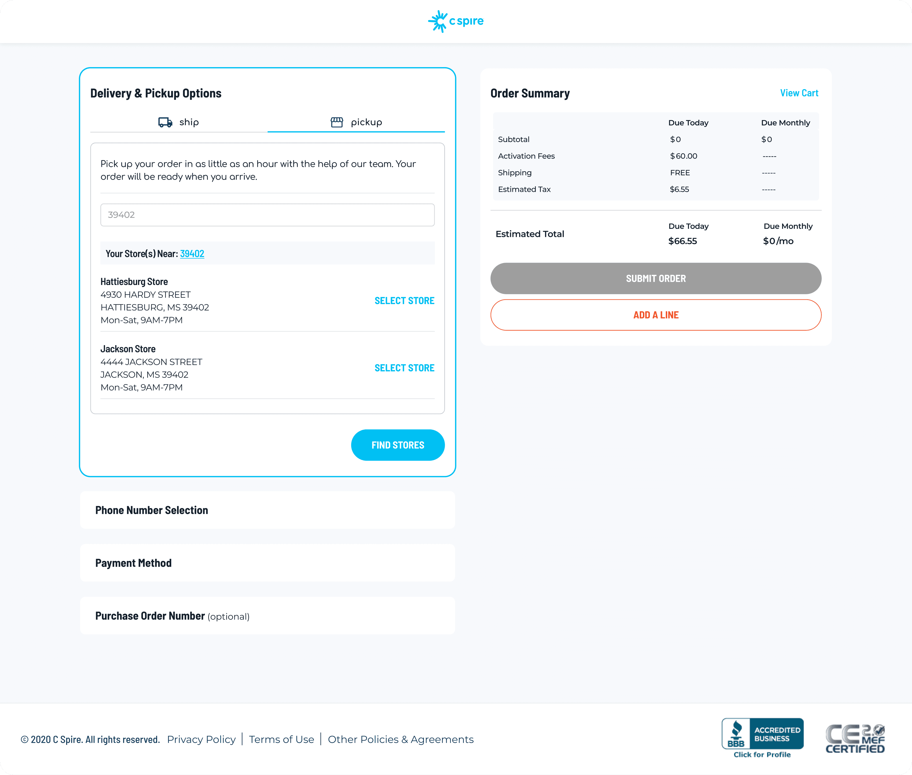
The shopping cart was streamlined to support multi-line visibility and bulk device management, empowering business users to review, edit, and proceed with large orders more confidently.
The shopping cart was streamlined to support multi-line visibility and bulk device management, empowering business users to review, edit, and proceed with large orders more confidently.
By surfacing critical details like cost breakdowns, installment terms, and line assignments upfront, we reduced confusion and made it easier for IT managers to validate large purchases in one glance.
We've integrated store lookup, shipping methods, and essential checkout details into a single view, and simplified the decision-making process and reduced delays in completing high-volume transactions.
The impact was substantial.
The impact was substantial.
Usability testing revealed a 42% reduction in checkout errors, a 4% increase in accessory purchases, adoption increased as more customers chose self-service rather than account-managed transactions, and onboarding time for new enterprise clients dropped by nearly 31%. In addition, junior designers on the project reported growth in their confidence and skills, with both advancing to mid-level roles the following year.
Usability testing revealed a 42% reduction in checkout errors, a 4% increase in accessory purchases, adoption increased as more customers chose self-service rather than account-managed transactions, and onboarding time for new enterprise clients dropped by nearly 31%. In addition, junior designers on the project reported growth in their confidence and skills, with both advancing to mid-level roles the following year.
Conclusion
This project reinforced the importance of tying design strategy to learning enablement and accessibility.
This project reinforced the importance of tying design strategy to learning enablement and accessibility.
By approaching the cart not just as a transactional tool but as a learning journey for B2B customers, we built an experience that supported both business efficiency and user empowerment. It also demonstrated my ability to set vision, mentor a team, and deliver measurable results, skills I continue to carry forward into every leadership role I take on.
By approaching the cart not just as a transactional tool but as a learning journey for B2B customers, we built an experience that supported both business efficiency and user empowerment. It also demonstrated my ability to set vision, mentor a team, and deliver measurable results, skills I continue to carry forward into every leadership role I take on.
Copyright 2025 Miyya Cody

Miyya Cody
Resume
About Me