SPECULATIVE CASE STUDY
Budget and Planning
Navy Federal Credit Union Mobile
DESIGNER
TYPE
SKILLS
TOOLS

COMPETITIVE PRESSURE IS REAL
Most top-10 banking apps (Chase, Bank of America, Capital One, USAA) now offer integrated budgeting and spending insights. NFCU’s closest competitor, USAA, has had budgeting tools for years. The absence is conspicuous.
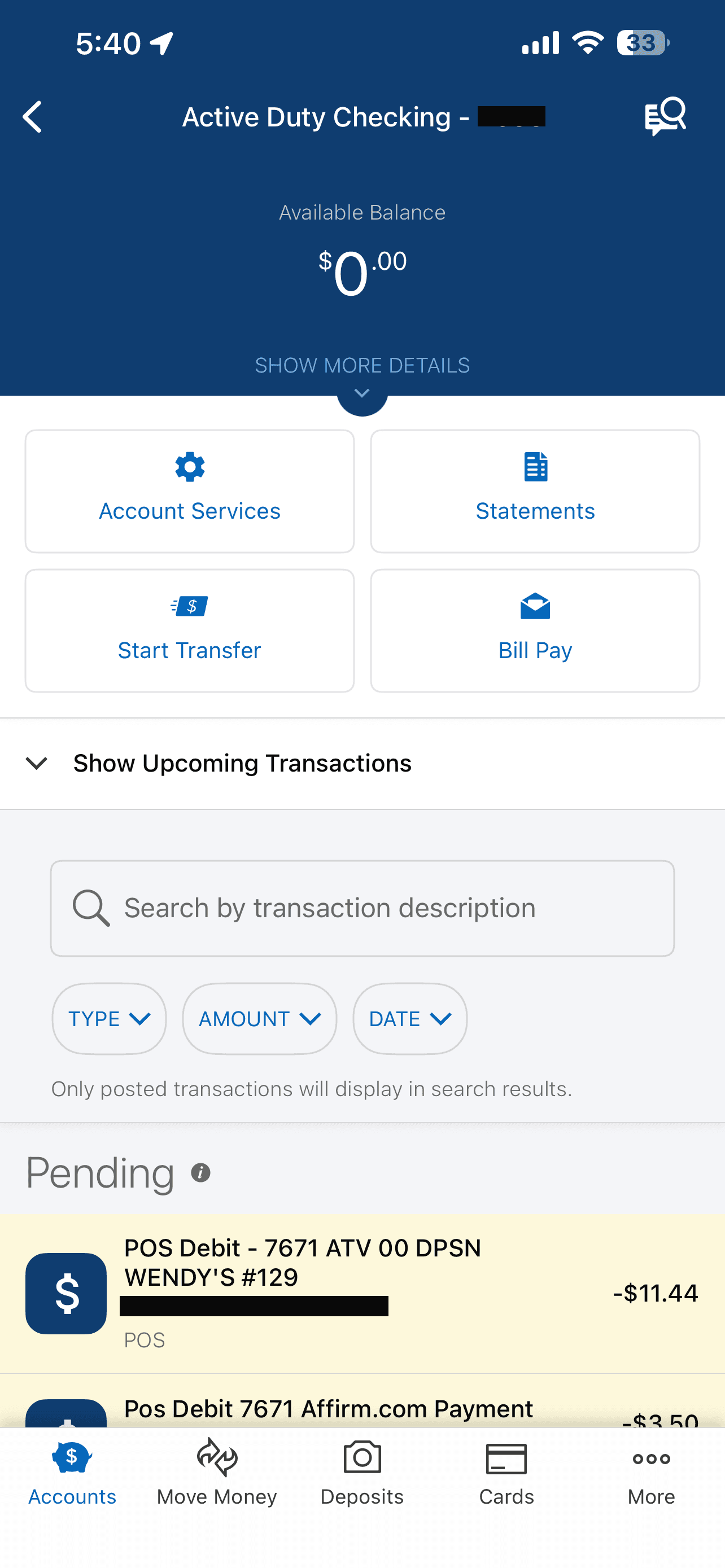
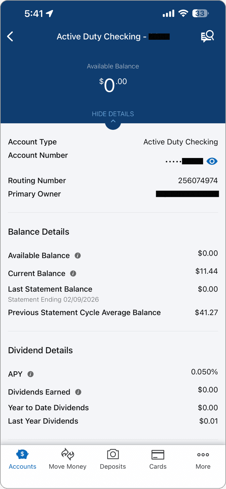
THE EXISTING APP ARCHITECTURE INVITES IT
THE MEMBER BASE HAS UNIQUE NEEDS
PROCESS
Without access to NFCU’s internal data, member research panels, or engineering constraints, I built my understanding from what’s publicly available and from my own analysis of the product:
Competitive Audit
I evaluated budgeting features across six banking apps (Chase, USAA, Capital One, Bank of America, Ally, SoFi) and three standalone tools (YNAB, Mint, Copilot). I documented patterns in navigation placement, onboarding friction, category management, goal-setting flows, and insight delivery. Key patterns:
Every app that embeds budgeting treats it as a primary navigation item, not a buried settings feature.
Auto-categorization of transactions is table stakes, manual-only categorization is the top complaint in App Store reviews for tools that require it.
Goal tracking with linked accounts (not just abstract targets) drives meaningfully higher engagement based on publicly reported data from Capital One and Ally.
Punitive overspending notifications are the most cited reason users abandon budgeting tools in App Store and Reddit feedback.


PRODUCT STRATEGY
Decisions before designs.
Before opening Figma, the product-level questions had to be answered.
I considered three options for the navigation placement:
OPTION A
New Bottom Tab
Add a 6th “Budget” tab to the primary navigation bar for maximum visibility and direct access.
❌ Breaks the established 5-tab pattern. High engineering cost. Re-architects the nav bar.
OPTION B
Sub-Feature of Accounts
Embed budget views within each individual account detail screen, leveraging existing transaction context.
❌ Fragmented user experience. Requires many clicks to access. Lacks visibility/discoverability. No unified view across accounts.
OPTION C
Dual Entry Point
Card on Accounts home screen + menu item in More tab, placed directly below MakingCents for natural financial wellness grouping.
✅ Preserves existing nav. Maximizes discoverability. Lowest engineering friction. Ships faster.
PRIORITIZATION
Not everything can ship at once. Each phase represents a natural threshold of data and integration requirements, not arbitrary sequencing.
LOW → HIGH IMPACT
Weekly
Chart
LOW → HIGH COMPLEXITY
Phase 1
Phase 2
Phase 3
The reasoning behind the phasing:
Phase 1 reads the data NFCU already has. Phase 2 requires new logic but connects to existing flows. Phase 3 needs external integrations that require dedicated investment.
Spending overview with visualization (progress ring)
Phase 1
Category breakdown with progress bars
Phase 1
Weekly spending bar chart
Phase 1
Savings goals linked to accounts
Phase 2
Smart spending insights
Phase 2
Bill calendar with due dates
Phase 2
Military pay schedule sync (DFAS)
Phase 3
DESIGNS
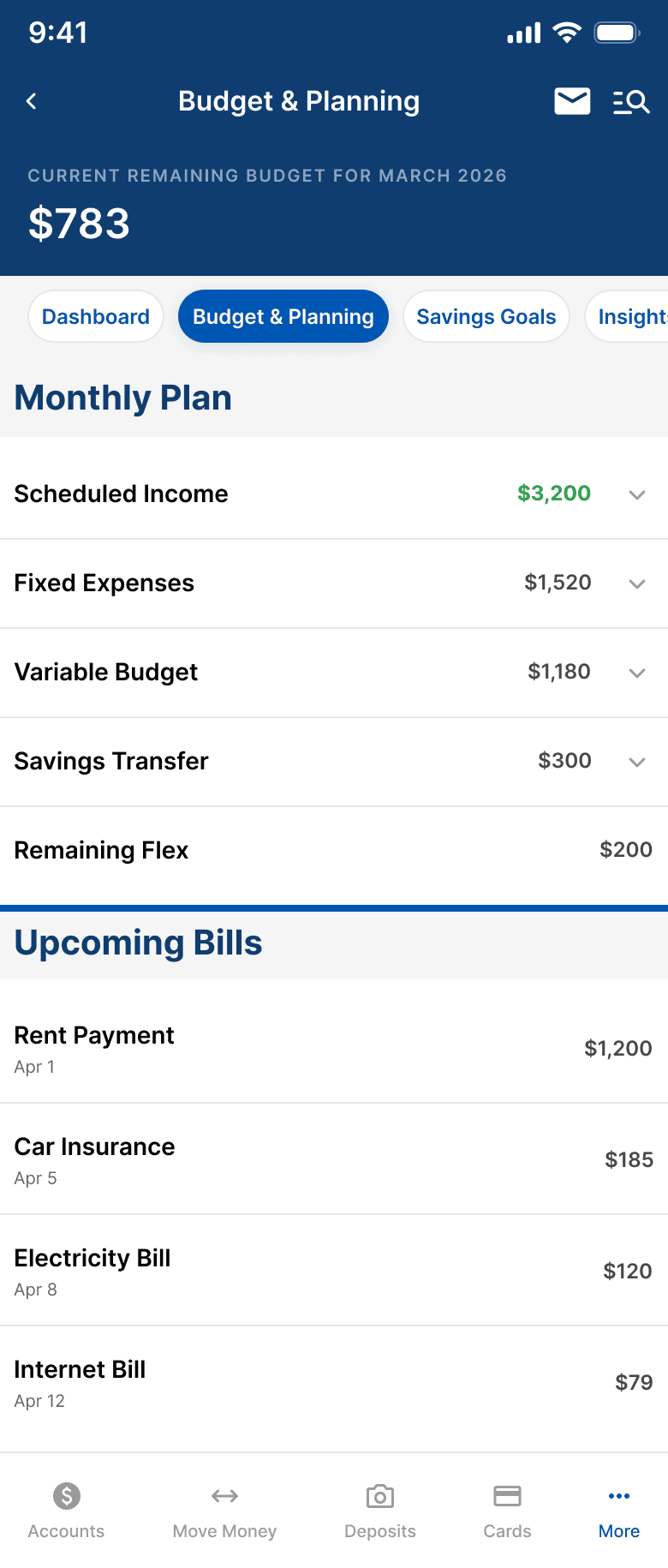
The Budget Dashboard screen leads with a single, immediate answer: "Am I okay?" Below is that same data visualized, exactly as a member would see it.


Every screen was designed to match NFCU's existing app exactly, same headers, same dividers, same patterns. A member should feel like this was always there.
SCREEN 3
Budget Details
Bridges budgeting with NFCU's existing transaction UI. Bill status labels (Autopay, Estimated, Scheduled) remove ambiguity at a glance.
SCREEN 4
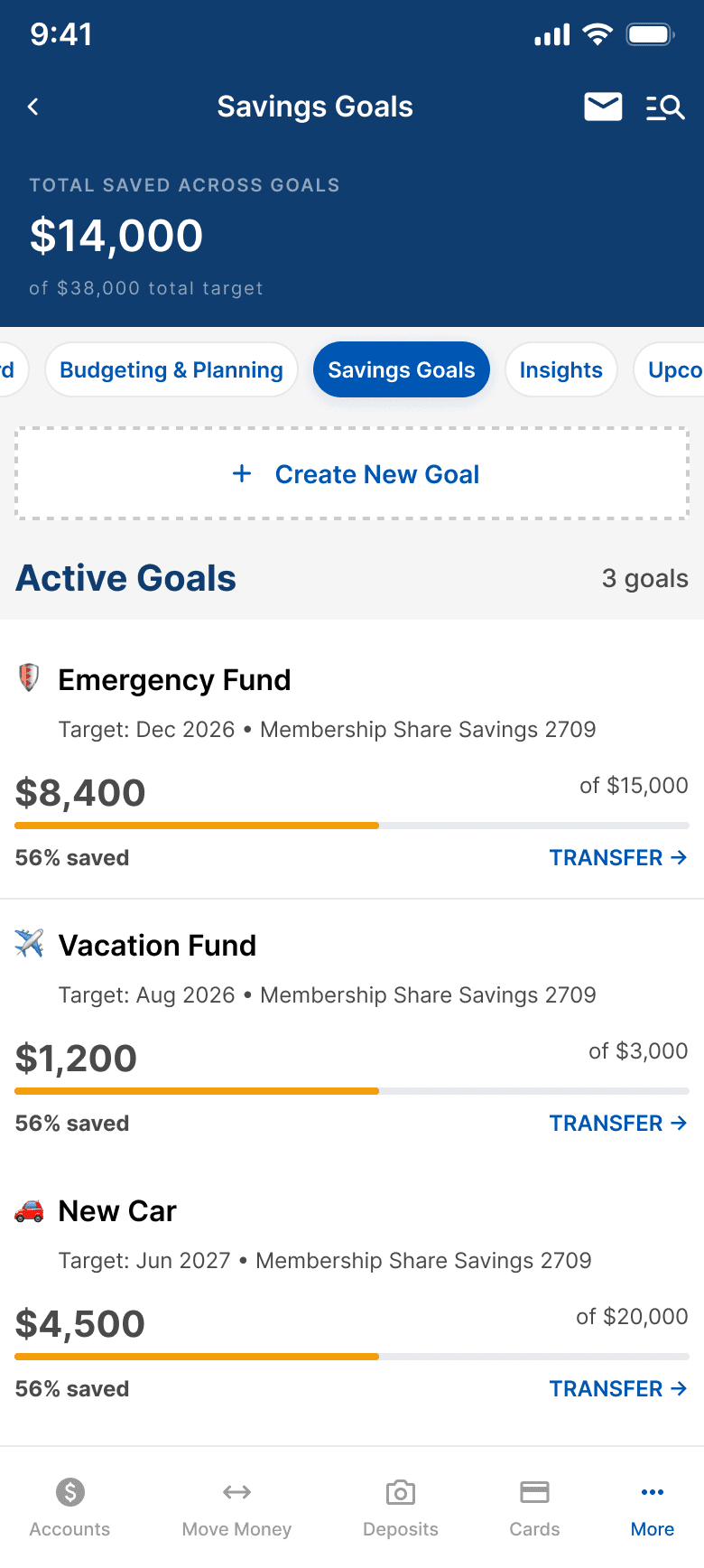
Savings Goals
Each goal card links to a real NFCU savings account. TRANSFER routes to the existing Move Money flow, zero new infrastructure.

SCREEN 5
Spending Insights
Proactive value, not passive data. Color-coded severity (amber/green/blue) and direct CTAs. Uses NFCU's existing info banner component.
🎯
Shame Shield
Amber + supportive microcopy instead of red + static labels. Competitive audit is clear: punitive notifications kill budgeting tool retention.
📱
Zero New Infrastructure
TRANSFER routes to Move Money. Goals link to existing savings accounts. Phase 1 reads from data NFCU already has. Ship faster, not harder.
🧠
Progress Framing
"56% saved" instead of "$6,600 remaining." Emphasize how far you've come, not how far you have to go. Small copy choice, large behavioral impact.
MEASURING
How I’d know what’s working
If this shipped, these are the five metrics I'd propose tracking, and why each one matters beyond the vanity layer.
📊
25-40%
Adoption Rate
Active mobile users who open Budget & Planning in the first 30 days. Industry benchmark for embedded banking features.
🔄
7-day
Return Rate
Users who return within 7 days of first open. Separates genuine utility from curiosity.
🎯
1+
Goal Creation
Users who create at least one savings goal. Indicates forward-looking financial behavior, not just backward-looking review.
✅
85%+
Task Completion
Members who complete core flows (set budget, review spending, create goal) without abandoning. Target 85%+ for all three.
📉
↓
3rd-Party Displacement
Decline in members connecting external budgeting apps after launch. The business case metric: keeping data in the NFCU ecosystem.
WITH MORE TIME
→ Build interactive Figma prototypes for all core flows
→ Guerrilla concept testing with 5–8 credit union members
→ Design the full onboarding flow: first-time experience, setup, first value moment
→ Map the notification strategy, a dedicated design problem of its own
WHAT I’D ADVOCATE FOR
✓ Ship Phase 1 with imperfect auto-categorization. Members correct it. Corrections improve the model.
✓ Invest in the Shame Shield approach even though it requires more content design work.
✕ Don't build a calculator disconnected from real account data. That's just a worse YNAB.
✕ Don't force military pay sync into MVP. It's the highest-emotional-impact feature, ship it right, in Phase 3.